



What is a Wireframe and how to make one step by step

Have you ever opened Figma and, in under ten minutes, already been picking typefaces and colors… without having clarified which screens you actually need? That impulse is common — and costly: when the visual layout arrives before the structure, every flow change forces you to redesign something that "already looked good."
• A wireframe is the structural blueprint of a screen: it defines hierarchy, content blocks, and flows before color, typography, or visual detail.
• It’s neither a mockup nor a prototype: a wireframe answers what’s there and where; a mockup answers what it looks like; a prototype answers how it behaves.
• Today, the value of a wireframe isn’t in the hand-drawn line — it’s in forcing UX decisions before you invest hours in polished UI or AI-generated output.
• A useful wireframe is built in 6 steps: brief and users → information architecture → flows → low fidelity → review against criteria → handoff or prototype.
• Before you sketch anything, answer three questions: what does the user need, what does the business need, what does the team need.
• Figma is the market standard for digital wireframes; pen and paper remain valid for the fast-divergence phase.
• AI can propose layouts; it doesn’t prioritize business goals, negotiate with stakeholders, or design for retention — that’s still human judgment!
• A weak wireframe is easy to spot: boxes with no priority, filler copy that doesn’t communicate function, and jumps straight to UI without validating the flow.
• Starting with UI (color, typography, shadows) before agreeing on structure or flows.
• Confusing wireframe with mockup and delivering “almost-UI” when the team asked for structure.
• Using lorem ipsum without indicating the function of each block (what it does, not just what space it fills).
• A single-screen wireframe when the product is actually a flow (onboarding, checkout, search).
• Generating layouts with AI and accepting them as valid without checking them against goals and users.
• Not annotating decisions: the next designer or developer has no idea what’s negotiable.
Here’s a scene that plays out in real projects all the time: a junior designer spends three days drawing wireframe sketches, only to hear in the first meeting with the Head of Product: “Very nice, but this isn’t what we need.” The mistake: starting to design before knowing what the screen is actually for.
If you’re studying UX/UI, coming from graphic design, or transitioning into digital product, the wireframe is one of the pieces most requested in real briefs and junior portfolios. Not because it’s “pretty,” but because it demonstrates judgment: you know how to separate what solves the user’s problem from how the interface is dressed up. Today, with generative AI accelerating full screens, that distinction matters more, not less.
A wireframe is the schematic representation of an interface: it shows the arrangement of elements, the hierarchy of information, and the main actions — without the final visual finish.
Working definition: the blueprint of the experience — what’s on each screen, in what order, and why — before deciding how it looks or investing in code.
The best wireframe isn’t the cleanest one — it’s the one that helps the user complete a task and helps the business hit a goal. If you’re only optimizing for visual clarity without converting or retaining, you’re solving the drawing, not the product.
It serves three concrete purposes. First, it aligns the team (design, product, business, development) on structure before debating the look. Second, it reduces risk: it’s cheaper to move a gray box than to rebuild a UI component. Third, it documents intent: a well-annotated wireframe explains why that CTA sits at the top, or why the form has three fields instead of eight.
In the UX → UI → prototype → design system journey, the wireframe is the bridge between research (what the user needs) and the interface (how it gets built). Anyone who only delivers “pretty” screens tends to skip that bridge — and it shows in reviews: broken flows, confused priorities, screens that don’t fit together.
Key idea: A wireframe is the structural blueprint of an interface — it defines blocks, hierarchy, and flows before visual design or the interactive prototype.
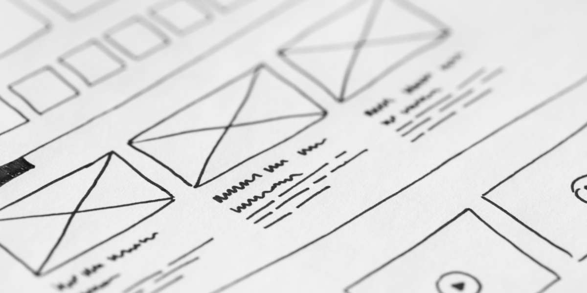
In digital product design, wireframe, mockup, and prototype represent three consecutive, essential stages of the UX/UI process.
The wireframe answers what’s there and where?, prioritizing function and structure through simple, low-fidelity schematics with no interaction. It’s used right after the basic architecture is set, to avoid designing pretty screens on top of broken navigation flows.
The mockup, in turn, answers what does it look like?, defining the aesthetics and look & feel in high fidelity — final interface, typography, and brand identity — but still static. It comes into play once the structure is approved, to prevent premature aesthetic debates.
Finally, the prototype answers how does it behave?, adding interactivity, transitions, and navigable flows to validate usability alongside the UI — avoiding the risk of reaching development without real evidence of use.
A classic junior-portfolio mistake is labeling a grayscale mockup as a “wireframe.” If it already has brand typography, iconography, and visual style, you’re in mockup territory — even if it’s monochrome. The wireframe prioritizes function and structure; everything else can wait.
Key idea: Wireframe = structure; mockup = appearance; prototype = behavior. Confusing them stretches out the project and muddies the feedback.
The quality of a UX wireframe isn’t measured by how attractive it looks, but by its ability to let the team make product decisions autonomously. There are 6 clear signals that separate a solid wireframe from a weak one:
Weak wireframe
• Priority: Every element carries the same visual weight, with no clear hierarchy.
• Copy: Uses lorem ipsum or generic placeholders like “text here.”
• Scope: Limited to loose, isolated screens.
• Annotations: Barely any context or explanatory notes.
• Feedback it triggers: Sparks irrelevant aesthetic debates (e.g., “I don’t like the style”).
• Handoff: Forces the development team to interpret the design blind.
Solid wireframe
• Priority: Clearly defines one dominant, priority task per screen.
• Copy: Includes real labels and instructions that explain function.
• Scope: Shows the full navigation flow and key system states.
• Annotations: Details assumptions, out-of-scope items, and open decisions.
• Feedback it triggers: Encourages functional usability debates (e.g., “what happens if the login fails?”).
• Handoff: Gives the team what it needs to build the product without guessing.
Key idea: A good wireframe reduces questions; a bad one multiplies them silently, all the way to the development sprint.
Wireframe fidelity isn’t a stylistic whim — it determines what kind of feedback you can ask for, and from whom.
Low-fidelity wireframe? The fastest schematic: boxes, lines, labels. Useful for exploring 3–5 structural directions in a single session and discarding them without attachment. Ideal on paper, a whiteboard, or Figma with basic shapes.
Mid-fidelity wireframe? Adds basic typographic hierarchy, recognizable navigation, and copy closer to the real thing. It’s the most useful format for stakeholder reviews with people who don’t “read” abstract boxes, without opening the brand debate yet.
High-fidelity wireframe? Almost UI, but still focused on structure and states (empty, error, loading). Use it carefully: the closer it looks to the final product, the more feedback turns aesthetic (“that blue doesn’t convince me”) and the less it discusses the flow.
Web, app, or mobile wireframe? The logic is the same; the constraints change. On web, you typically negotiate more information density and global navigation. On app/mobile, you prioritize thumb zone, one dominant action, and fewer visible options at once (less cognitive load). A responsive wireframe isn’t “the same screen shrunk down” — it’s deciding which blocks survive, stack, or hide behind progressive disclosure.
Advice from the LABASAD faculty: “Choose the lowest fidelity that still lets you make a decision. If you can decide with gray boxes, don’t open the UI kit.”
A solid wireframe doesn’t start on the canvas — it starts with the problem. This six-step journey fits equally well in a master’s program exercise or a product sprint.
Before you draw: align user, business, and team
1. Before opening Figma — or asking an AI for layouts — answer each of these in a single sentence:
2. What does the user need? (task + entry context)
3. What does the business need? (conversion, retention, support, compliance…)
4. What does the team need? (what has to be locked down for product, design, and development)
If you can’t answer all three, you’re not designing a solution yet — you’re still trying to understand the problem.
1. What problem, and for whom?
Summarize the user’s goal and the business metric (if there is one) in one sentence. Example: “Get a new user to complete sign-up in under 3 minutes without help.” Without that, the wireframe is just structural decoration.
Product-designer questions that often change the drawing:
• What happens if the user arrives with no context (deep link, campaign, notification)?
• What happens when the login fails or the session expires?
• Which block creates the most cognitive load — and can it be removed or deferred?
2. What content, in what order? (Information architecture)
List screens and blocks before drawing: header, search, listing, detail, CTA, empty states. Order by task priority, not by “what looks nice.” This is where a content inventory or a lightweight sitemap fits in.
Apply chunking: group what the user processes together, because the brain handles small clusters better than one long list of loose options. If a screen asks users to choose between eight equivalent options, you’re ignoring Hick’s Law (more options → more decision time). Ask yourself: what can wait for a second step (progressive disclosure)? Reveal only what’s necessary now — that lowers cognitive load without removing information from the product.
3. What’s the critical flow?
Draw the happy path and 1–2 deviations (error, drop-off, returning user). A single-screen wireframe is rarely enough for onboarding, checkout, or search.
On junior teams, it’s common to see a flawless home screen… and no recovery flow at all. Product asks for a full rebuild not because of aesthetics, but because the wireframe never accounted for the most frequent real-world case after the happy path.
4. What does the structure look like in low fidelity?
Blocks, hierarchy, tap zones, navigation. Annotate assumptions: “we’re assuming social login,” “the filter is secondary.” Annotations are part of the deliverable.
Think about visual hierarchy and scanning: can the main action be found in under 5 seconds? On mobile, Fitts’s Law reminds us that small targets far from the thumb cost more time and more errors. This principle also shows up in guidelines like Material Design and the Apple Human Interface Guidelines, which recommend minimum sizes for tap targets. The wireframe should already anticipate the size and position of CTAs, even before there’s any color.
5. Handoff, prototype, or UI?
If the structure holds up, decide on the next artifact: a clickable prototype for testing, or a move into UI/mockup. Document what’s locked in and what’s still open — that’s what separates a portfolio-quality wireframe from a loose file.
Design management is precisely what governs these kinds of decisions: when to diverge, when to converge, and how to avoid burning out the team in endless review cycles.
Problem: An e-commerce brand needs to boost mobile conversion.
First wireframe: A dense view with filters, upsells, and three CTAs at the same level.
What went wrong: There was no dominant task and no payment-error state — feedback drifted toward aesthetics.
The fix: A 4-step flow (product page → cart → payment → confirmation), one CTA per screen, and upsells moved into progressive disclosure.
Result: The conversation shifted from “make it prettier” to conversion.
Just remember these three things:
1. A wireframe decides structure and priority, not look & feel.
2. Without flow or states, there’s no product thinking — just a screen.
3. Before UI (or AI), validate against a checklist: task, CTA, hierarchy, states, handoff.
Key idea: Brief → architecture → flow → low fidelity → review criteria → handoff. Skip the first step, and everything after it is an empty drawing.
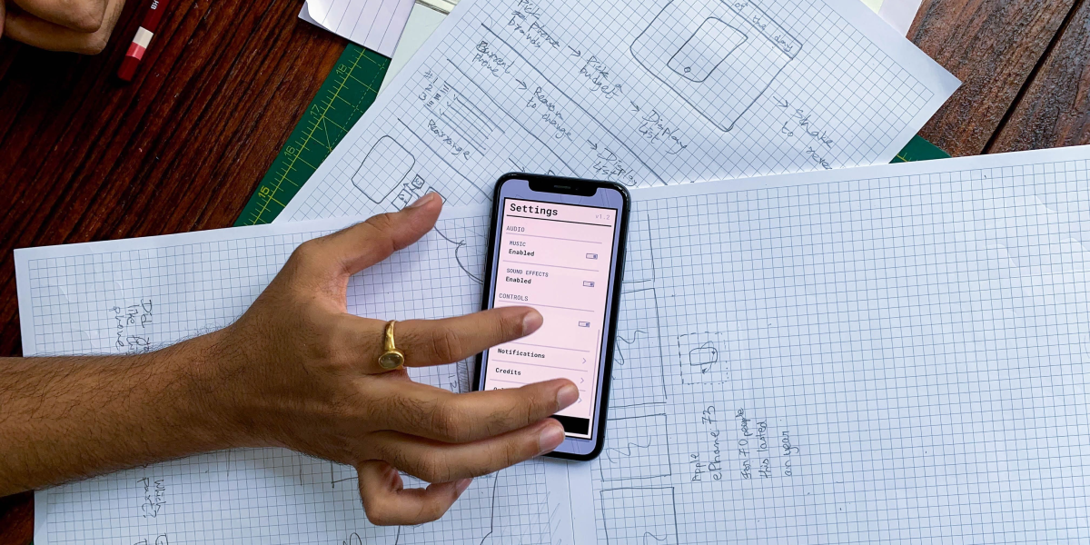
You don’t need to design the design system at the gray-box stage. You do need to avoid locking in decisions that will break it later.
In real projects, a wireframe anticipates the system when you:
1. reuse patterns (list + detail, forms, navigation) instead of inventing a different layout for every screen;
2. leave mental room for components (primary button, input, card) without styling them yet;
3. annotate state variants that will later become tokens or component variants.
• Brand color, final typography, illustrated iconography.
• Shadows, illustrations, and “portfolio-style” microinteractions.
• Visual exceptions per screen that you won’t be able to scale (the silent enemy of any design system).
A good wireframe leaves the ground ready for the system; a “near-UI” wireframe mixes structure with style and makes it more expensive. Later, those decisions get materialized through components, Figma Variables, design tokens, and component properties — including responsive logic. That depth belongs to the next phase; here it’s enough not to mortgage it.
Key idea: In the wireframe, anticipate patterns and states; postpone brand, final typography, and exceptions the design system won’t be able to sustain.
The tool doesn’t define the quality of the wireframe — the method does. Even so, by 2026 the market has largely converged.
Figma dominates because it brings together wireframe, UI, prototype, and handoff in a single environment — and because it’s the backbone of digital design courses across specialized programs. Other tools like FigJam, Balsamiq, or generative AI tend to be less precise and less integrated into design systems, but they excel in other areas.
The risk isn’t Figma itself — it’s opening the component library before the structure is locked. One of the most common mistakes on junior teams: a wireframe in Figma that’s already a mockup two hours in… and the feedback stops talking about flow.
Key idea: Use the simplest tool that still lets you decide. Across digital teams, Figma is the standard; the judgment is still yours.
AI speeds up divergence (more layout options in less time). The designer supplies convergence (which structure makes it into the flow, and why).
What AI CAN do
• Propose structural variants from a short brief (3–4 different layouts to compare).
• Suggest content hierarchies or block labels based on an inventory.
• Generate empty or error states as a draft, always reviewed.
• Summarize feedback from Figma comments to spot patterns of doubt.
What it can’t do (even if it fakes it)
• Prioritize business needs over user desire (or vice versa) when there’s a real conflict.
• Negotiate with stakeholders what gets built this sprint and what gets shelved.
• Design trade-offs (fewer fields today to boost activation; more friction tomorrow for compliance).
• Think about retention: what makes a user come back, not just complete screen one.
• A generated layout can look “complete” and still be wrong for the product. AI multiplies options; it doesn’t take responsibility for judgment.
The article on Creative Systems and generative AI fits in here: AI changes the pace of the process; it doesn’t replace the judgment about which problem you’re actually solving. And if you’re browsing AI-tool roundups, 5 AI tools you can’t miss can work as a map — but wireframing demands method, not a catalog.
LABASAD tip: “Ask the AI for three different structures and choose using a user checklist. If you can’t explain why one wins, you don’t have a wireframe yet — you have options.”
Wireframes fail less because of “bad drawing” and more because of deciding badly what to draw. In practice, about half “die” after the first review — not because the line work is ugly, but because it never answered the three questions of user, business, and team.
1. Premature aesthetics. Color, illustrations, or brand typography at the structural stage derail feedback. The designer jumps into UI early to feel “safe”; the PM asks for a redo because there was never agreement on the task.
2. Orphan screen. Delivering a home screen with no flow behind it (search → results → detail → conversion).
3. Empty copy. “Text here” doesn’t communicate function; “Order list (status, date, reorder CTA)” is better.
4. No states. Only the happy path: missing empty, error, loading, permissions, mobile. Development can’t “read” a wireframe when it has to invent the failure case.
5. No annotations. The developer has to interpret; the stakeholder fills the gaps with assumptions.
6. Wrong fidelity. High fidelity too early, or low fidelity in an executive review with no context.
7. Unfiltered AI. Adopting the first generated layout because “it already looks like product.”
8. Ignoring mental models. If the navigation pattern contradicts what the user already knows (tabs, cart, search), the “correct” wireframe on paper fails in real use.
Key idea: A good wireframe reduces questions. A bad one multiplies them — silently, all the way to the development sprint.
In a portfolio, a wireframe isn’t shown as an isolated file — it’s shown as evidence of process. Recruiters want to see what the problem was, which options you discarded, and why that structure won. In portfolio reviews, the same gap shows up over and over: final mockups with no wireframe to justify the decisions — or an orphan wireframe with no flow.
1. Context — product, user, constraint (time, tech, business).
2. Problem — the goal statement (task + outcome).
3. Exploration — 2–3 directions in low fidelity (including the ones you discarded).
4. Chosen wireframe — the full flow, not just the “pretty” screen.
5. Learning — what you validated (test, review, metric) and what you’d change.
The guide on how to build a professional portfolio while studying online makes the same point: visible process, not just final mockups. And LABASAD’s own experience with the UX/UI Master shows how digital product projects are built in phases — wireframe included — not as a single aesthetic delivery.
Key idea: In a portfolio, the wireframe earns its place if it shows problem, options, decision, and flow. Without that, it’s just a drawing with no judgment.
Does a wireframe always have to be done by hand? No. Paper speeds up divergence; Figma (or another digital tool) makes versioning, comments, and handoff easier. Choose based on the phase.
How many screens should it include? Whatever the full critical flow requires (happy path + key states). A single screen rarely proves UX thinking.
Can I use color in a wireframe? Better to avoid it at low and mid fidelity. If you do use it, limit it to flagging hierarchy or errors — not applying brand.
Are a wireframe and a prototype the same thing? No. The wireframe structures; the prototype simulates behavior. You can link wireframes together for a low-fidelity prototype, but they’re not equivalent.
Does AI replace the wireframe? No. It can propose layouts; prioritizing business needs, negotiating scope, and validating retention are still human judgment.
Do you need to design the design system in the wireframe? No. It’s worth anticipating reusable patterns and states — and postponing brand, final typography, and visual exceptions.
Are web and app wireframes made the same way? The logic is the same; on app/mobile you prioritize one dominant action, thumb zone, and fewer visible options at once.
If, while reading this, you’ve started thinking in terms of flows and priorities — and not just pretty screens — you’re already reasoning the way digital product teams work.
Going deeper into that journey — from information architecture to prototype, design system, and handoff with development — is exactly what the Online Master in Digital Product Design & AI at LABASAD offers: a 60-ECTS, 12-month program (Onlive methodology) focused on Figma, UX, UI, prototyping, and design systems, taught by an expert faculty. You don’t need to master the perfect wireframe today — you need to want to design interfaces with judgment.