



Corporate Visual Identity: The Key Elements of a Memorable Brand

Say "Apple," "Coca-Cola," or "Nike" and you're already picturing the logo, the color, maybe even the typeface — without trying. That's exactly what strong corporate visual identity does: it lodges a brand in your head without a second thought.
• You recognize a brand by its color, typeface, and style long before you read its name — that’s corporate visual identity: the graphic system that keeps a brand consistent across every touchpoint.
• A memorable identity doesn’t hinge on a logo. It depends on a system that stays coherent as the brand grows — documented in a brand manual or, for digital products, in a design system.
• Logo, color, typography, graphic resources, applications, and manual aren’t a checklist of deliverables — they’re the six building blocks that, properly connected, turn a symbol into a recognizable brand.
• An identity that only works on a presentation slide fails in a favicon, an avatar, or dark mode. Text contrast in interfaces must meet 4.5:1 (WCAG AA).
• AI is what accelerates divergence; the designer provides convergence — deciding what belongs in the system and what gets cut is still a human call.
Say “Apple,” “Coca-Cola,” or “Nike” and you’re already picturing the logo, the color, maybe even the typeface — without trying. That’s exactly what strong corporate visual identity does: it lodges a brand in your head without a second thought.
If you’re studying graphic design, working as a creative, or in visual communications, mastering corporate identity isn’t optional — it’s one of the most in-demand skills at agencies, studios, and brand departments. And today, with generative AI speeding up production, the line between “making graphics” and “designing a brand” comes down to judgment: knowing which decisions are strategic and which are just execution.
Here’s a breakdown of the elements every corporate visual identity needs, and how to build a memorable brand step by step.
• Delivering only the logo, with no reversed-color variant or documented minimum size.
• Picking colors “by eye” instead of locking in technical values (HEX, RGB, CMYK, Pantone).
• Choosing trendy typefaces that don’t hold up in body text.
• Ignoring dark mode and interface contrast (WCAG reference: 4.5:1 for normal text).
• Treating AI outputs as finished pieces without unifying style or checking authorship.
• Skipping the brand manual — so every team member reinterprets the brand their own way.
Corporate visual identity is the set of graphic elements that represent an organization consistently: logo, colors, typography, visual assets, and rules for how they’re applied across every surface the brand touches.
Working definition: it’s the visual translation of brand strategy into concrete, repeatable, documented pieces.
Branding covers more ground: positioning, tone of voice, customer experience, internal culture, and value proposition. Visual identity is one part of branding — the most visible one. At LABASAD, we tell students: if your verbal tone contradicts your color palette, or your in-store experience doesn’t match what your website promises, a polished logo won’t save you.
When there’s a digital product involved, identity can evolve into a design system: reusable components, design variables (color, typography, spacing), and shared libraries in Figma that connect brand to product. You won’t always get there on a first project — startups with a digital product from day one are the exception — but it’s worth understanding the distinction. Many brands will never need a full design system; a well-made PDF manual and template set can carry a brand for years.
In studios and agencies — and in the projects reviewed during training — graphic designers and art directors tend to collaborate at different stages: the designer handles system execution, the art director makes sure every piece fits a broader creative idea. Once a project moves into development, new friction shows up: the logo that worked on a slide doesn’t scale down to a favicon, or the brand color fails contrast in dark mode.
Many students think an identity is finished once the logo gets approved. In reality, that’s usually when the real work starts.
Picture opening the Spotify app without seeing the logo: the green, the gradient sliding into magenta, and the typeface already tell you where you are. That visual territory took years to build — the icon is just the visible tip. Airbnb did something similar with the “Bélo,” a coral palette, and a photography style built around belonging that holds the same experience across web, app, and campaigns, even when the symbol isn’t in frame. Without that consistency, it would just be an isolated drawing.
When the system breaks down, the logo ends up orphaned — perfectly fine in the manual’s PDF, unrecognizable in a badly exported Story. Agencies and studios see this constantly during review: a solid logo, applications that look like they belong to different brands.
Three reasons the system matters more than the logo:
1. Recognition. The brain picks up on patterns before it registers details.
2. Trust. Visual consistency signals professionalism; inconsistency signals doubt.
3. Scalability. Without rules, every new channel — TikTok, packaging, email — turns into an improvised redesign.
The idea of flexible visual identity shows that “memorable” doesn’t mean “rigid” — there are rules for what can flex and what can’t.
Advice from LABASAD faculty: “Before you open Illustrator or Figma, write one sentence describing the emotion the brand should trigger. That sentence filters every color and type decision. Without that north star, you end up with a pile of nice-looking styles that don’t tell the same story.”
The key elements are the logo, color palette, typography, graphic style, applications across media, and the brand manual. Each block serves the same strategy, and these six pillars show up consistently in agency briefs and academic portfolios alike.
The logo is the primary mark of identification: it can be an icon, a combination mark, or a wordmark. Variants — horizontal, vertical, monochrome, reversed, responsive — keep it legible without distorting the brand.
When reviewing portfolios, one of the most common mistakes is a single PNG file with no variants and no defined clear space. In production, that turns into stretched logos, illegible backgrounds, and unrecognizable favicons.
An effective logo generally meets four criteria: simplicity, distinctiveness, versatility, and durability — with planned exceptions in fast-moving sectors. The 2010 City of Melbourne rebrand, for instance, is still studied today because it turned a crest into a generative visual grammar: the geometric pattern of the “M” adapts to events, signage, and web without redesigning the logo each time — hundreds of applications without losing unity.
Corporate color represents a company’s personality — it’s not decoration. In an identity project for a financial company, a cooler blue can signal solidity; for a youth-focused consumer brand, a warmer coral can feel more approachable. Design students need to understand that color choice isn’t an aesthetic whim — it’s positioning. If you’re torn between two colors, the problem probably isn’t the color — it’s the positioning.
For mid-sized identities, one anchor color, one or two secondary colors, and a set of neutrals for backgrounds and text is usually enough — multi-brand systems or complex editorial identities may need broader palettes. What matters is documenting exact values in Pantone, CMYK, RGB, and HEX, and checking WCAG contrast (4.5:1 for normal text at AA). For digital products, plan for both light and dark mode from the start.
Typography sets tone and legibility. Mid-sized projects usually need just two type families — one for display, one for text — except in magazines, editorial identities, or systems spanning multiple languages. Hierarchy matters more than variety: headline, body, and caption need to keep consistent proportions across brochure, web, and presentation.
IBM Plex is a go-to reference because IBM replaced Helvetica with an open-source family designed for screens, reports, and code — not “a nice font,” but a brand decision that scales from annual report to dashboard using the same typographic logic.
Icons, illustrations, patterns, and photography criteria all need to share the same formal logic. In digital systems, stroke weights are often kept consistent — frequently in multiples of 4 or 8px, though there’s no universal rule. If the iconography is linear but the photography is saturated HDR, the system breaks even if the logo itself is flawless — a common issue when mixing AI outputs without a unifying eye.
Think about your audience’s real journey. A B2B SaaS startup lives on the web and LinkedIn; a consumer brand lives in packaging and point of sale. Designing stationery, uniforms, and signage without prioritizing the touchpoints people see first spreads your effort thin — a common mistake in academic projects working against tight deadlines.
Every surface — social, web, print, digital product — is a stress test. The tension between consistency and adaptation also shows up in debates like blanding versus challenger branding: some brands soften their system, others sharpen distinctiveness to break out of a category.
The manual documents proportions, prohibited uses, and correct versus incorrect examples. It lets printers, community managers, and developers implement the brand without reinterpreting it. More elements can make an identity look more solid — but that’s not necessarily true: the best identities tend to remove more decisions than they add. If you have to over-explain a logo, the system isn’t doing its job yet. A minimum viable manual covers logo, color, typography, graphic style, reference applications, and incorrect uses.
A PDF brand book used to be enough for most projects — and it still is for plenty of brands today. For projects with a significant digital component, identity can extend into design tokens, Figma Variables, dark mode, responsive logos, accessibility, and multi-brand architecture. Not every project needs the same depth: a local restaurant can run on a PDF for years; a SaaS startup probably needs a variable-based system from day one. The useful question to ask is: “Who’s going to implement this brand after me, and with what tools?”
Advice from LABASAD faculty: “Always include at least three real applications in your portfolio — one printed, one digital, one in motion or social. Show that the system lives outside the manual’s PDF.”
AI doesn’t replace the craft. Tools like Adobe Firefly or generative assistants can propose color directions, mockups, or icon variations. The risk shows up when proposals get mistaken for decisions.
Key idea: AI accelerates divergence; the designer provides convergence — deciding what makes it into the final system and what doesn’t.
The article on Google Pomelli, brand identity, and AI automation digs into how far automation goes today. The useful takeaway isn’t “the machine designs your brand” — it’s which tasks to delegate and which ones not to.
Use AI to explore and generate variations; keep human judgment for deciding what actually enters the final visual system.
Authorship stays intact when you document the process, manually refine what’s generated, and stay transparent with the client about what was AI-made and what wasn’t. If a decision only makes sense when you’re there to explain it, it’s not really part of the system yet. In portfolio reviews, integrating AI with good judgment reads as a real skill; relying on it without review — mismatched icons, clashing styles — tends to get spotted immediately.
When convergence fails — too many unfiltered variations, outputs with no unifying judgment — that’s when identities start showing the weaknesses covered below.
LABASAD tip: “Master the craft. Lead the technology. Design with judgment.” AI can propose ten palettes — you pick one, and you know why.
In portfolio reviews, what most often signals a lack of judgment isn’t a mediocre logo — it’s AI-generated iconography that doesn’t share stroke weight, color logic, or level of detail with the rest of the system.
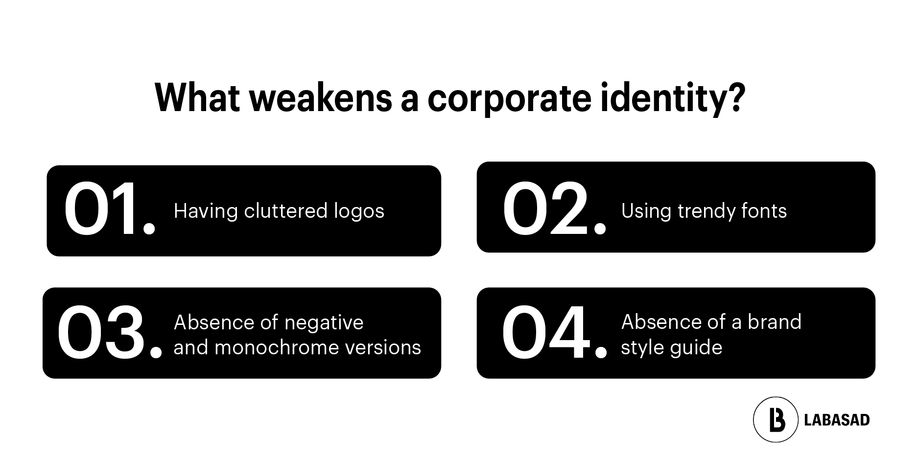
Beyond the quick mistakes mentioned earlier, portfolio and junior-profile reviews tend to surface the same issues: overloaded logos that don’t scale down, trendy typefaces that fail in body copy, missing reversed or monochrome versions, loose PNGs delivered with no manual, unfiltered AI outputs, and dark mode getting ignored on digital brands.
Brands that swap their avatar every month chasing trends (glassmorphism, neo-brutalism) start looking like personal accounts, not organizations. Flexibility has limits — and as design professionals, it’s worth documenting where those limits sit.
A visual identity doesn’t fail the moment someone breaks a rule. It fails when the rules stop being useful to the people who actually have to apply them.
A strong case study includes the brief, a process with visible discarded directions, the final system, at least three real-world applications, and reflection on the decisions made — including AI, if it was used.
1. Context — sector, audience, constraints.
2. Challenge — what visual problem needed solving.
3. Process — research, exploration, visible iterations.
4. System — logo, color, typography, graphic resources.
5. Applications — print + digital + motion or social.
7. Takeaways — what worked, what you’d change.
One of the most common portfolio mistakes is showing only the finished result — pretty mockups with no brief and no explanation of why that palette and not another. Recruiters are looking for process and judgment, not just polish.
A checklist helps you avoid missing pieces. But beyond the checklist, an identity is generally considered finished when three conditions are met — beyond the deliverables list:
1. Another designer can implement it without asking you questions. The manual explains enough on its own — it doesn’t depend on your memory or scattered files with no context.
2. It works the same way in digital and in print. It’s not one logo for screens and another for paper — it’s a system that holds up in both worlds.
3. The client can expand it two years from now without redesigning it. New channels, products, or sub-brands fit within the existing rules instead of breaking the brand.
Key idea: The best identities reduce the number of decisions someone else has to make.
If any one of these three fails, the project may be “delivered” — but it isn’t finished.
Most identities don’t fail on launch day. They fail six months later, when someone has to use them without the designer around.
When a company goes from 5 employees to 500, the first thing to break usually isn’t the logo — it’s the improvised templates, the “close enough” colors in PowerPoint, and the typeface each department picks on its own. The manual that worked fine for a founder and one outside designer stops scaling once community managers, salespeople, and vendors who never saw the brand book start using the brand.
The usual order of collapse: palette first (undocumented shades), then typography (approximate substitutes in slide decks), then applications (every channel reinterprets the graphic style). A mature identity plans for this ahead of time: shared templates, examples of incorrect use, and clear rules for what can be adapted without permission. Designing for day one is necessary — designing for year three is what separates a deliverable from a brand that can actually handle growth.
Are visual identity and a brand manual the same thing? No. The identity is the system; the manual is the document that explains how to use it.
How many colors does an identity need? A tight palette is usually enough — one anchor color, secondaries, and neutrals. Multi-brand or complex editorial systems may need more.
Do you need a design system from day one? Not always. With a significant digital product, it’s worth planning a variable-based system from the start; for traditional branding, a PDF manual can last for years.
Can I include an AI-assisted project in my portfolio? Yes — as long as you document the process: what you generated, what you refined manually, and why.
How many identity case studies do I need in my portfolio? One or two complete studies is usually enough for junior profiles — better one solid case than four shallow ones.
If reading this got you thinking in systems instead of just logos — how a brand behaves in packaging, in a brochure, in a favicon, in dark mode — you’re already thinking the way teams that build memorable brands think.
Going deeper into that mindset — with real projects in identity, motion, editorial, and digital product — is exactly what LABASAD’s Online Master in Graphic Design with AI specialisation offers: it includes a Corporate Visual Identity project (9 ECTS) within a 12-month program, using the Onlive methodology with academic mentorship.
You don’t need to have it all figured out today. You just need to want to design with judgment.