


Digital Naïf Illustration: The Language of Analog Naïf
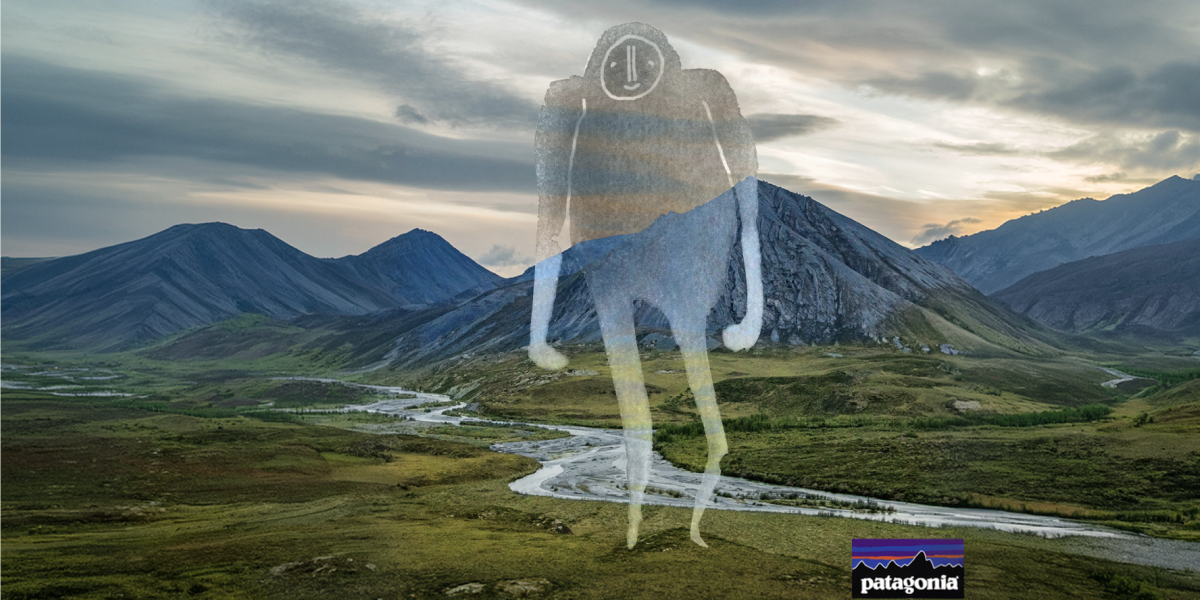
Discover digital naïve illustration, its analogue textures, and techniques such as risography and linocut. Explore key references, creative processes and applications.
Digital naïve illustration combines the formal spontaneity of naïve art with the graphic resources of analogue printing techniques. It is characterised by simplified shapes, expressive proportions, organic strokes and textures that evoke processes such as linocut, risography and hand printing.
Its appeal lies in the possibility of bringing the materiality and distinctive qualities of traditional processes into the digital environment, creating visual languages that explore the relationship between technique, experimentation and personal expression.
For years, much of digital illustration has been shaped by the pursuit of clean finishes, precise outlines and perfectly controlled compositions. The evolution of digital tools has greatly expanded technical possibilities, but it has also helped establish certain visual codes that, when repeated, can lead to a degree of visual uniformity.
In response to this trend, elements associated with hand-drawn gestures, irregular strokes and printmaking textures have regained prominence across different areas of visual communication.
This is where Analog Naïf comes in, a term we use to describe the combination of elements from naïve art with the material qualities of traditional drawing and printing processes.
It is not simply about introducing imperfections into a digital illustration. Rather, it is about understanding how graphic accidents, technical limitations and the distinctive characteristics of each process can become expressive tools.
At LABASAD, we explore this visual language through its key references, techniques and professional applications to understand the creative possibilities it offers illustrators and designers.
Digital naïve illustration brings together different formal elements to create an expressive and recognisable visual identity. Its visual language combines simplified shapes, compositional freedom and textures inspired by analogue techniques.
Its main characteristics include:
– Organic strokes: lines that retain the gesture of the hand, with variations in pressure, rhythm and direction.
– Simplified shapes: figures that reduce the elements of a representation to their essential visual structures.
– Expressive proportions: alterations in scale and perspective driven by a communicative or aesthetic intention.
– Irregular ink: marks, varying densities and outlines that evoke traditional printing techniques.
– Print textures: paper grain, eroded surfaces, printing marks and traces of the creative process.
– Colour misregistration: slight shifts between colour layers that recall the registration errors found in traditional printing systems.
These elements do not work in isolation. Their value depends on how they interact with the composition, visual hierarchy and concept of the project.
An irregular stroke can add dynamism and expressiveness, while overlapping ink layers can create colour depth. However, when these elements are introduced without a clear purpose, they can interfere with the readability of the image.
Imperfection does not mean a lack of technical skill. It means understanding the rules of visual language well enough to decide when and how to transform them.
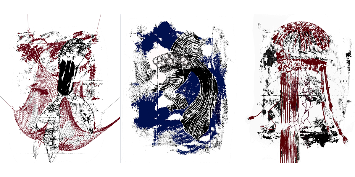
To understand this visual language, it is important to explore the two worlds that inspire it: naïve art and analogue graphic production processes.
Naïve Art: An Intuitive Representation of Reality
Naïve art is characterised by a personal interpretation of shapes, space and proportions. Its compositions may feature unconventional perspectives, simplified figures and colour relationships that move away from academic conventions.
One of its key references is Henri Rousseau, a self-taught painter whose works create highly distinctive visual worlds through flat figures, unusual perspectives and a unique interpretation of space.
His work shows how formal simplification and freedom of representation can become central elements of an artistic approach.
Analogue Tradition: The Imprint of the Process
The second world comes from traditional drawing and printing techniques, such as linocut, screen printing, risography and stamp printing.
Each process has its own material characteristics that influence the final result: pressure applied to the surface, ink absorption, colour layering and the irregularities inherent in printing.
When these two worlds come together in the digital environment, a graphic language emerges that combines formal freedom with material experimentation.
The renewed interest in analogue finishes coincides with a period of transformation in image production. Digital and generative tools make it possible to achieve technically sophisticated results in less time, but their widespread use also raises questions about differentiation, authorship and the development of visual identity.
In this context, graphic languages associated with hand-drawn gestures and materiality are gaining renewed relevance.
An irregular line, an ink mark or an overlapping layer of colour can provide insight into the creative process and establish a different relationship between the image and the viewer.
Not because these resources are necessarily more human, but because they allow artists to explore expressive approaches that differ from conventional digital finishes.
There is also a cultural dimension. The revival of traditional printing techniques connects with practices such as self-publishing, fanzines, independent illustration and handmade graphic production. These are creative fields where material experimentation and the uniqueness of the process play an important role.
This does not mean that analogue and digital illustration are opposing worlds. Many professionals combine both methods to make the most of their respective possibilities.
At LABASAD, we believe that technology does not replace talent; it enhances it. What matters most is the judgement behind the tools and the ability to develop a visual language of your own.
In a world where image production is becoming increasingly accessible, developing a distinctive creative vision is especially valuable.
Understanding traditional processes makes it possible to translate their distinctive qualities into the digital environment more coherently. Each technique has its own material logic and produces different visual results.
Linocut: Shapes, Contrasts and Carving Marks
Linocut is a relief printing technique. It involves carving a sheet of linoleum using specialised tools, removing the areas that should not receive ink. The remaining surface is then inked and used to create the print.
The result is characterised by contrasts between areas of colour and empty spaces, carved lines and the irregularities inherent in manual work.
In digital illustration, this visual language can be recreated through solid blocks of colour, simplified shapes, strong contrasts and outlines that retain a degree of irregularity.
Risography: Overlapping Inks and Registration Shifts
Risography is a printing system that combines automated processes with characteristics traditionally associated with layered printing.
Each colour is printed separately using an ink drum. This system makes it possible to create colour overlays, distinctive textures and slight registration shifts between individual passes.
In the digital environment, its main visual references include print grain, flat inks, vibrant colours and the colour combinations created when two layers overlap.
Stamps and Ink Pads: Irregularity and Ink Density
Stamp printing introduces variations caused by pressure, the amount of ink used and the characteristics of the printing surface.
These conditions produce areas of varying density, irregular edges and small uninked sections. They are particularly useful for creating worn surfaces and adding a sense of materiality to illustrations.
Screen Printing: Flat Colour and Layer Construction
Screen printing makes it possible to work with flat inks and overlapping colours. The relationship between the different layers and the printing surface creates particularly interesting expressive possibilities for editorial projects, posters and applied illustration.
Although both techniques produce visually distinctive results, their printing processes are very different.
Risography uses a printer that applies each colour separately through layers of ink. This makes it possible to create overlapping colours, transparencies and slightly misaligned registration effects, with vibrant colours and a grainy texture.
Linocut, on the other hand, is a handcrafted relief printing technique. It involves carving a sheet of linoleum, inking the raised areas and transferring the image onto paper. The result stands out for its contrasts, expressive lines and bold shapes.
Understanding these differences makes it easier to choose the right resources for each project and prevents techniques from becoming mere aesthetic references.
Digital illustration makes it possible to reproduce and reinterpret many of the visual qualities of traditional techniques. However, to achieve convincing results, it is worth working from the logic of each process rather than simply applying a generic texture at the end.
This workflow can serve as a starting point.
1. Work with a Limited Colour Palette
Risography and other layered printing techniques offer great examples of how to build compositions using a reduced number of inks.
Choose two or three main colours and explore their relationships. Limiting the palette encourages you to make decisions about contrast, hierarchy and visual balance.
The goal is not to eliminate every tonal variation, but to build a colour structure that is consistent with the graphic language you want to achieve.
2. Organise Your Illustration into Ink Layers
Think of each colour as a separate printing pass. Working with individual layers allows you to control overlaps and experiment with slight misalignments between elements.
In programmes such as Photoshop, you can use the Multiply blending mode to explore how different layers interact and create new colour combinations.
3. Preserve the Gesture of the Drawing
Digital tools often include stabilisation systems that make it possible to create highly controlled lines.
To achieve a more organic aesthetic, you can adjust these settings and work with brushes that reproduce the variations in pressure and texture found in traditional tools.
The aim is not to introduce random irregularities, but to preserve the distinctive qualities of the drawing gesture and find a balance between expressiveness and control.
4. Build Your Own Textures
One of the most interesting possibilities is to create graphic resources using physical materials.
You can work with ink on paper, experiment with stamps, explore markers or create small handmade prints. You can then scan these materials and turn them into brushes, masks or reusable resources in programmes such as Procreate or Photoshop.
This process allows you to develop a texture library connected to your own creative practice, rather than relying exclusively on generic resources.
5. Explore Irregular Outlines
Layer masks and textured brushes allow you to modify the edges of shapes and reproduce some of the characteristics of traditional printing.
You can experiment with eroded outlines, incomplete ink coverage or small variations across surfaces. What matters is ensuring that these resources remain consistent with the overall composition.
6. Incorporate the Texture of the Surface
Paper is not simply a background: it is also part of the visual language of a printing technique.
You can experiment with different grain levels, tonal variations and scanned textures to introduce a material dimension into your illustration. It is important to adjust their intensity and contrast so that they complement the main elements without compromising readability.
Once you have defined your graphic language, you can start developing a cohesive collection of pieces and adapting these resources to different formats.
In this process, building a professional portfolio is essential to showcase not only the results, but also the methodology and decisions behind each project.
A convincing analogue finish comes from understanding the process that inspires it. Texture is a consequence of visual language, not an effect added simply to imitate it.
One of the risks of any visual trend is that its resources eventually become recognisable, repeated formulas. Analog Naïf is no exception.
When texture, grain or colour misregistration are applied without any connection to the project’s concept, the result can become a superficial reproduction of a fashionable aesthetic.
To avoid this, it is worth working from three principles:
Intention. Every graphic element should respond to a deliberate decision. What does that texture bring to the piece? Does it reinforce its character, change how it is interpreted or establish a connection with the concept?
Consistency. Different elements should share a common visual logic. If you work with registration errors, ink irregularities or organic strokes, define how they fit into the overall composition.
Hierarchy. The expressiveness of textures should not compromise communication. Composition, legibility and the relationship between elements remain essential.
It is also important to understand that not every discipline or brief requires this type of visual language. Choosing an aesthetic should always start with the project’s needs and its application context.
The difference between following a trend and developing your own style lies in the ability to make informed creative decisions.
LABASAD Tip: Review your illustration at different scales and, if possible, produce a printed proof. Observe how the textures, contrasts and colour overlays work. The result should maintain its visual intention both on screen and in its final format.
Visual languages inspired by traditional printing techniques offer possibilities across different creative disciplines. Their value lies not only in their appearance, but also in their ability to build graphic systems with a recognisable personality.
Editorial Design and Poster Design
The combination of flat inks, simplified illustrations and printing textures makes it possible to create editorial pieces with a distinctive visual identity.
In poster design, these resources can help establish hierarchies, generate contrast and create an expressive relationship between imagery and typography.
A relevant example is the visual identity of the 2025 Junceda Awards, which Martín Tognola, illustrator and LABASAD professor, developed through animated and static pieces.
Packaging
Graphic resources associated with printing and materiality can help build a visual identity connected to craftsmanship, a sense of closeness or experimentation.
Their application should respond to the product’s positioning and target audience, avoiding the use of an artisanal aesthetic as a visual code without context.
Brand Identity
In branding, illustration can become a distinctive element within an identity system.
The development of characters, patterns, iconography and graphic resources makes it possible to create a recognisable visual language that adapts to different formats.
Music, Fanzines and Self-Publishing
Independent music culture and self-publishing have a long-standing relationship with experimental graphic languages.
Linocut, screen printing, flat inks and handmade textures offer particularly interesting resources for covers, posters, publications and merchandise.
Digital Communication
Social media and digital campaigns can also incorporate these visual languages.
The challenge lies in adapting the expressiveness of textures and compositions to different formats and sizes while maintaining the project’s visual consistency.
For those building a career in illustration and design, exploring these resources makes it possible to expand their graphic repertoire and discover new forms of expression. However, their real professional value does not lie in reproducing a specific aesthetic, but in knowing how to develop a visual language of your own and apply it with creative judgement.
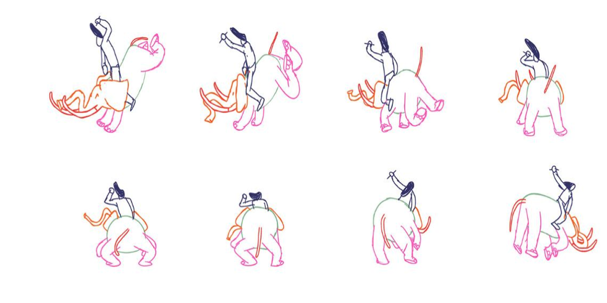
To understand how these principles translate into a real project, let’s consider a graphic identity exercise for an independent music festival.
This hypothetical brief allows us to explore how an aesthetic decision can become a visual system that works across different formats.
Context. An independent music festival needs to develop a graphic identity that conveys experimentation, a sense of connection and personality. Illustration will play a central role in communicating the event.
Creative Challenge. Build a recognisable visual language that can be applied to the main poster, tickets, merchandise and digital assets. The aesthetic should reflect the festival’s identity rather than simply reproduce a graphic trend.
Process. The project could begin with ink sketches on paper, exploring characters, shapes and compositions. Once the initial proposals have been selected, they are digitised while preserving some of their original irregularities.
Next, a limited colour palette is defined and the illustrations are organised into separate colour layers. Slight registration shifts, printing textures and variations in outlines are incorporated in a controlled way.
Visual System. The next step is to establish a set of rules that ensures consistency across different applications: colour palette, texture treatment, character proportions, typographic elements and composition guidelines.
This way, the identity moves beyond a standalone illustration and becomes a graphic system capable of adapting to different communication needs.
Applications. The system can be extended across the main poster, tickets, promotional materials, social media posts, merchandise and venue signage.
Each format has its own requirements, so the composition and hierarchy of elements must be adapted without losing the overall visual identity.
Professional Takeaway. When presenting a project of this kind in your portfolio, it is important to explain the reasoning behind your creative decisions.
Showing an attractive piece is not enough. You need to provide context for the brief, introduce your references, explain the experimentation process and justify how the visual system was developed.
The ability to articulate and defend design decisions is an essential part of any illustrator’s professional development.
If you want to explore how to build a personal brand as a freelance illustrator, the experience of Malen Pazos, a LABASAD student, offers an interesting starting point.
What is digital naïve illustration?
Digital naïve illustration is a visual language that combines the formal spontaneity of naïve art with graphic elements inspired by analogue printing techniques. It is characterised by simplified shapes, expressive proportions, organic strokes and textures that evoke processes such as linocut and risography.
What characterises the naïve style?
The naïve style is characterised by an intuitive and personal representation of reality, featuring simplified shapes, expressive proportions and unconventional perspectives. Its visual language moves away from certain academic conventions and uses colour and composition as expressive tools.
What is the difference between naïve and analogue illustration?
Naïve illustration primarily refers to a visual language characterised by formal simplification and freedom in proportions and perspectives. Analogue illustration, on the other hand, refers to creative processes carried out using physical techniques and materials such as pencils, ink, paper and printmaking.
How can you create a digital risograph texture?
To recreate the risograph effect digitally, work with a limited palette of flat inks, organise each colour on a separate layer and experiment with slight registration shifts. You can use the Multiply blending mode to explore colour overlays and incorporate scanned paper and ink textures.
What is the difference between risography and linocut?
Risography is a printing system that works with layers of ink, while linocut is a relief printing technique that uses a carved linoleum block. The former stands out for its colour overlays and possible registration shifts; the latter for its contrasts, carved lines and bold areas of colour.
What tools are used to create digital naïve illustration?
Illustration and editing programmes such as Procreate and Adobe Photoshop can be used. It is also possible to combine digital tools with physical materials, such as ink, paper and stamps, to create original textures that can later be digitised and incorporated into the composition.
Does the naïve style mean deliberately drawing badly?
No. Naïve art is characterised by a particular interpretation of shapes, proportions and space that does not necessarily follow academic conventions. Its expressiveness comes from its own visual language, not from a lack of technical knowledge or skill.
Do you need analogue materials to work in this style?
Not necessarily, as many of its visual elements can be created digitally. However, experimenting with ink, paper, stamps or printing techniques provides a better understanding of their material qualities and allows you to create original textures that bring a distinctive character to your project.
The renewed interest in analogue visual languages reminds us that illustration does not depend solely on the technical possibilities of the tools we use. It is also shaped by observation, experimentation and the ability to make formal and expressive decisions.
Analog Naïf is one of many ways to explore this relationship between technique and creativity. Its visual resources allow you to experiment with new approaches to colour, composition, gesture and materiality, but its true potential emerges when they become part of a coherent visual language.
Developing your identity as an illustrator takes time, practice and knowledge of different disciplines. It involves experimenting with techniques, studying references, understanding creative processes and finding your own way of interpreting each project.
In LABASAD’s online illustration master’s programmes, you will develop your visual language through traditional and digital techniques, using the Onlive methodology and receiving guidance from experienced lecturers. Choose the programme that best suits your creative path:
Because building a professional career in illustration is not just about mastering tools or reproducing styles. It is about developing your own perspective, knowing how to bring it to life and turning it into a creative proposal with a distinctive identity.