


Guerrilla Branding on TikTok and Instagram: Designing for the Algorithm
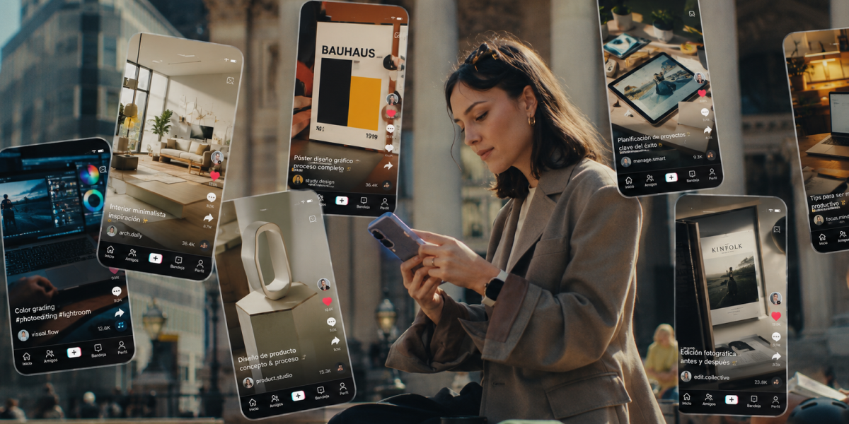
There's a scene that repeats itself in every small studio or agency: a brand with almost no budget, no access to paid media campaigns, competing in the same feed as giants with entire audiovisual production departments. And still, it wins. Not with more money, but with more visual intelligence.
• Digital guerrilla branding is the adaptation of classic guerrilla marketing (low budget, high impact, creativity as the main weapon) to the infinite-scroll environment of TikTok and Instagram.
• It’s not about “viral hacks” — it’s about designing flexible brand systems that work within the retention and pacing rules the algorithm imposes.
• The first 2-3 seconds of any piece are the real visual battlefield: if you don’t stop the user’s thumb, nothing else in the design matters.
• A “guerrilla-ready” brand needs a minimal but highly recognizable visual kit — you don’t need a 100-page brand manual, you need a system that works vertical, in motion, and at full speed.
• The most expensive mistake isn’t aesthetic, it’s strategic: publishing without a system makes every piece compete against the others instead of building cumulative brand recognition.
That’s essentially what guerrilla branding looks like once it moves to the digital space: the idea that ingenuity and design systems outweigh budget. But here’s the mistake most junior profiles and design students make when they approach this topic: they think “guerrilla” means improvisation — publishing fast, without thinking, betting that something will just “blow up.”
Guerrilla branding that actually works on TikTok and Instagram isn’t creative chaos — it’s a system disguised as spontaneity. Understanding that difference is exactly what separates a creative who knows how to design for the algorithm from someone who simply posts content and hopes for luck.
Here, we’ll see that there’s no such thing as a “viral trick,” and we’re going to talk about what actually matters: how to design a brand identity that is recognizable, coherent and effective within the rules of infinite scroll, without losing the strategic essence that has made guerrilla branding work for decades — long before TikTok existed.
• Confusing “guerrilla” with “no planning.” Apparent spontaneity always hides a system behind it.
• Copying visual trends without adapting them to brand identity, losing recognizability in the process.
• Not designing for vertical format from the start, adapting content at the last minute that was conceived for other formats.
• Ignoring the first few seconds, placing the logo or key message at the end of the piece, once the user has already left.
• Publishing without visual coherence between pieces, so every post competes against previous ones instead of adding to accumulated recognition.
Snippet: guerrilla branding that works is never pure improvisation — it’s a design system flexible enough to look spontaneous.
Guerrilla marketing was born in the 1980s as a response to a very specific limitation: small brands with no budget to compete with big traditional advertising campaigns. Their power wasn’t money — it was the unconventional creativity of graphic designers: street interventions, surprise actions, messages that relied on wit and context rather than media investment.
That same principle — doing a lot with little, leaning on creative intelligence rather than budget — is exactly what has migrated to the digital environment. Only now the “urban space” is the feed, and the “street intervention” is a piece of content that interrupts someone’s scroll for a second and a half.
The fundamental difference is the battlefield. Before, the challenge was capturing the attention of someone walking down the street. Today, the challenge is capturing the attention of someone whose thumb is on autopilot, exposed to hundreds of pieces of content a day. This is exactly what designers need to keep in mind today: capturing attention with surprising visual pieces.
At LABASAD, we stress that the strategic principle is identical — surprise, stand out, communicate fast — but the design tools are completely different: vertical format, editing rhythm, typography that’s legible on small screens, and a visual identity that has to be recognized in fractions of a second, not necessarily through a visible logo.
In an ecosystem where paid advertising is increasingly expensive and organically less effective, brands with tight budgets — startups, studios, personal brands, small businesses — depend more than ever on design doing the work money used to do. This isn’t a passing trend: it’s a structural consequence of how the attention economy works today.
LABASAD tip: We keep telling our branding students that guerrilla marketing was never about zero budget — it was about maximum intelligence. Translated to social media, that means: before you think about the video, think about the visual system that makes that video unmistakably yours.
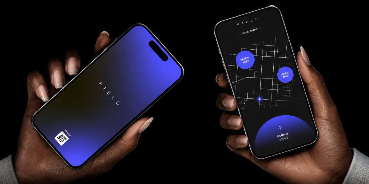
This is where many creatives get their approach wrong: they treat the algorithm as a marketing or content-strategy problem, when in reality it’s largely a visual design and pacing problem.
TikTok and Instagram’s algorithms prioritize retention metrics: how long someone stays watching a piece, whether they rewatch it, whether they interact within the first few seconds. In fact, TikTok for Business’s own creative best practices recommend introducing your value proposition within the first 3 seconds to maximize recall and attention — direct confirmation, straight from the platform, that designing those opening instants isn’t optional. This means design no longer competes just on being pretty or on-brand — it competes on retaining measurable attention in real time. And that’s a design variable as important as color palette or typography.
Retention, visual pacing and the first 3 seconds
The first few seconds of any piece are, without exaggeration, the single most important design element in the whole strategy. If the user doesn’t stop within that minimal window, no other creative effort further down the line will get the chance to communicate anything. This forces a rethink of classic visual hierarchy: the strongest message or visual hook can no longer sit at the end or at the climax — it has to be at the beginning, even if that breaks with more traditional advertising-design narrative structures.
Designing for the “thumb-stop”: visual hierarchy in vertical format
The concept of the “thumb-stop” — literally, what stops the user’s thumb mid-scroll — is one of the most decisive design variables in this environment. This means working with:
• High contrast from the very first frame, to stand out from the surrounding content.
• Composition designed for vertical from the start, not adapted after the fact from a horizontal format.
• On-screen text that’s legible in under a second, with clear typographic hierarchy even with the sound off.
• Purposeful motion: cutting and editing rhythm isn’t just aesthetic, it’s a retention tool.
Snippet: on vertical social networks, design no longer just communicates brand — it measures its own effectiveness in real retention time, second by second.
This is where guerrilla branding radically differs from simply “making content that works”: the key is that every piece, however spontaneous it looks, reinforces a recognizable brand system.
Flexible visual systems vs. rigid identities
Traditional brand manuals, designed for static applications (stationery, signage, packaging), don’t work well in an environment where content is produced daily and with limited resources. What a “guerrilla-ready” brand needs is a flexible visual system: a small set of elements — color palette, typography, an editing tone, maybe a recurring graphic element — that can be applied quickly, in very different contexts, without losing identity.
Brand coherence without falling into algorithmic monotony
The most interesting design challenge here is the balance between coherence (so the brand is recognizable) and variety (so the algorithm doesn’t penalize repetitive content, and the user doesn’t get bored). The solution isn’t repeating the same template over and over, but defining recognizable design principles — a consistent accent color, a headline style, a transition style — that can be applied with creative variations without losing the thread of identity.
LABASAD tip: One of the exercises we run in the Branding Master’s is forcing students to design three pieces that are completely different in format, tone and execution, but that anyone can recognize as coming from the same brand without seeing the logo. If they pull it off, they truly understand what a flexible brand system is.
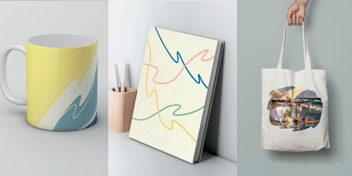
Not every failure is about visual design — many are about brand strategy, and they’re just as decisive:
1. Chasing the trend instead of the identity: jumping on every viral format or effect without filtering whether it fits the brand’s personality, generating noise instead of recognition.
2. Not documenting or systematizing what works: publishing reactively without analyzing which visual elements generated better retention, losing the chance to build on what already works.
3. Prioritizing one-off reach over long-term brand building: a viral piece that isn’t remembered as “from that brand” is a wasted opportunity, no matter how many views it gets.
4. Ignoring coherence across platforms: treating TikTok and Instagram as identical environments, when each has its own consumption language and format expectations.
Minimum viable visual kit for social media
You don’t need an extensive brand manual to get started. The essentials are:
• A reduced color palette (2-3 main colors) with high contrast, designed to stand out in a saturated feed.
• A typeface that’s legible on mobile, prioritizing clarity over excessive sophistication.
• A recurring graphic or editing element (a transition, a frame, a shape) that acts as a recognizable visual signature.
• A consistent visual tone of voice: does the brand communicate with humor, seriousness, a minimalist or maximalist aesthetic? That decision has to show up in every piece.
To better understand how to build a corporate visual identity, or to dig into concepts like the difference between branding and “blanding,” you can take a look at LABASAD’s article on corporate visual identity.
Small and medium brands that have built strong recognition on TikTok and Instagram without big budgets tend to share a pattern: a very simple but absolutely consistent visual identity, a defined tone of communication from day one, and the ability to adapt current trends without losing their particular visual signature. You can find several examples of these cases in write-ups like YouScan’s roundup of genius guerrilla marketing examples. The design lesson is always the same: the system lets you improvise without losing identity — never the other way around.
• I’ve defined a minimal visual system (color, typography, recurring graphic element) that applies to any piece
• Every piece is designed for vertical format from the start, not adapted afterwards
• The first 2-3 seconds communicate the visual hook or the main message
• I can visually recognize the brand in every piece, even without the logo showing
• I’ve documented which visual elements drive better retention, so I can iterate on them
• The project demonstrates system and strategy, not just execution of one-off trends
Presenting a guerrilla branding project in your portfolio requires the same strategic rigor as any other brand identity project. This is the structure we recommend at LABASAD:
Context: what brand is it, what budget or resource limits existed, and which platforms did the visual system need to work on?
Challenge: what was the specific design challenge? For example: building brand recognition without ad spend, or adapting a static identity to a daily-content environment.
Process: show how you arrived at the visual system — reference exploration, palette and typography tests, retention tests if you ran any.
System: this is the key section for this type of project. Explain the flexible design principles you defined and why they work both in static and moving pieces.
Applications: show the system applied to several real pieces, across different formats and platforms, demonstrating coherence without repetition.
Learnings: close with a reflection on what worked, what didn’t, and how you measured success beyond one-off reach — this demonstrates strategic thinking, not just creative execution.
Snippet: a social branding portfolio that shows the system behind the content, not just the final pieces, demonstrates art-direction thinking, not just execution.
Do I need a complete brand manual to do guerrilla branding on social media? No. In fact, an extensive manual can slow down the agility this kind of strategy needs. What’s essential is a minimal but highly consistent visual kit: color, typography and a recognizable graphic element.
Does guerrilla branding work the same way on TikTok as on Instagram? Not exactly. Although they share the vertical format, TikTok rewards authenticity and the platform’s native editing rhythm more, while Instagram (especially Reels and the feed) tends to value aesthetic cohesion with the rest of the brand profile more.
How much budget do you actually need to apply this strategy? The whole principle of guerrilla branding is precisely reducing dependence on budget in favor of creative intelligence and design systems. You can start with minimal resources: a phone, a well-defined visual identity, and consistency in publishing.
What matters more, the first image or the video’s message? Both work together, but in terms of algorithmic retention, the visual impact of the first few seconds usually determines whether the message even gets a chance to communicate at all. Without that initial “thumb-stop,” the best message in the world won’t be seen.
How do I know if my brand system is flexible enough? A good test is trying to design very different pieces in tone and format and checking whether they’re still recognizable as coming from the same brand without showing the logo. If you can do that, your system is solid.
Guerrilla branding on TikTok and Instagram doesn’t reward whoever posts the most or has the biggest budget — it rewards whoever understands that, behind every seemingly spontaneous piece, there has to be a solid, flexible and coherent brand design system. That’s the real ingenuity: making strategy look like intuition.
If you want to stop improvising and learn to build brand systems that work both in a corporate manual and in a feed that changes every week, the Online Master in Brand Strategy — Onlive format, with academic credit recognition — gives you the methodology, the tools and the guidance of working professionals to build a brand portfolio that speaks the language of today’s industry.